Logos are the first impression of a brand. They're the foundation that all other marketing materials and assets are built from. A good logo is timeless, universal, and makes an instant connection with your audience. When our clients come to us looking for a full rebranding service, one of the key aspects is the logo.
In recent times, one of our favourite projects has been the rebranding of Cattanach, a Scottish charity trust whose focus is on early years development.
Having outlined 2020 as a year of change, improvement and new ambition, Cattanach approached us to deliver a brand redesign that was contemporary and instantly recognisable, whilst retaining their Scottish association. It also had to be flexible, working seamlessly across all channels, mediums and applications.
Here's a breakdown of how we went about giving Cattanach the perfect logo for their business.
Initial Research
Prior to any design work taking place, we first had to develop an understanding of Cattanach as a business and hear in their own words what they wanted this new logo, and wider brand, to say.
We started out with an interview, asking them a series of questions that were split into 4 categories:
- About the company - values and/or mission statement - these questions allowed us to get a better idea of how the business operated and the services they provided, what goals the business was trying to achieve as well as learn who they viewed as competitors.
- About the target audience - these questions were aimed at discovering who the new logo and branding should be speaking to along with how they planned to communicate with their target audience.
- About the branding - this is where we learnt about Cattanach's values. With the new logo, we wanted to make sure it expressed those values clearly.
- Design Preferences - these questions help us narrow in on certain design choices. Learning what the client has strong feelings about, positive or negative, what colours the client prefers means that when we begin our design process, we are starting on the right path.
Throughout this initial research process, we were also able to nail down 4 key challenges that the logo had to address. These were to be the barometers of success at the end of the project.
1. Unique: The logo had to be instantly recognisable
2. Contemporary: It had to be fresh, clean, youthful yet traditional
3. Flexible: Seamless across all the channels, mediums and applications
4. Scottish but not a cliche: It had to retain the Scottish association but in a subtle way
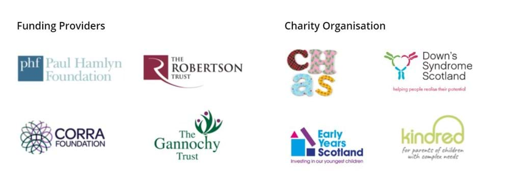
The first step in our research was to review the logos and branding of Trusts and Charities that operate in Cattanach's space.
The Creative Process
Once the initial research had been carried, our designers moved onto the creative process and began sketching out various logo concepts. This stage is very much an experimental stage with the goal of ending up with 3 concepts that we felt could meet the brief. We use them to guide the client through the process toward the final design.

Winning Concept
After the initial exploratory stage, the next stage of the process was to narrow down the concepts that we felt worked. The importance of expressing Cattanach's four values through their brand and logo itself was something we wanted to include; integrity, love, consideration, hope.


What stood out amongst it all was the idea of strengthening relationships, and how individuals can be made stronger with support from each other. Not only did the four links reflect this, but it also had a childhood memory of weaving lollypop sticks together, which in turn, had a nod to a tartan weave. At this point, we knew we had the foundations of our new logo.
Evolving the idea
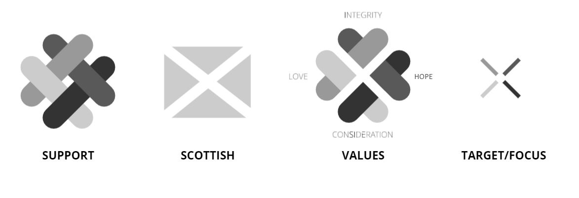
Once we had the foundation of the logo, we started to expand on the initial idea of strengthening relationships. At this stage, we were keen to ensure the logo addressed the four key challenges that the logo had to address. Overlaying a saltire cross over the base graphic revealed four hearts that represented Cattanach's values. One final element was the target which represented the targeting of children between 0 - 3.
Introducing Colour
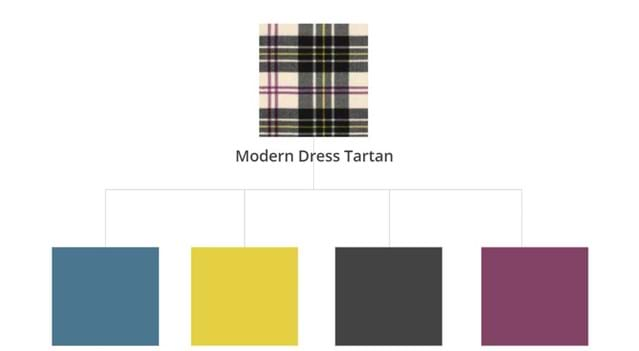
In keeping with the Scottish heritage, we adopted the colour palette of the Cattanach Modern Dress tartan which had tones of yellow, slate grey and purple on a cream background.
Putting it all together
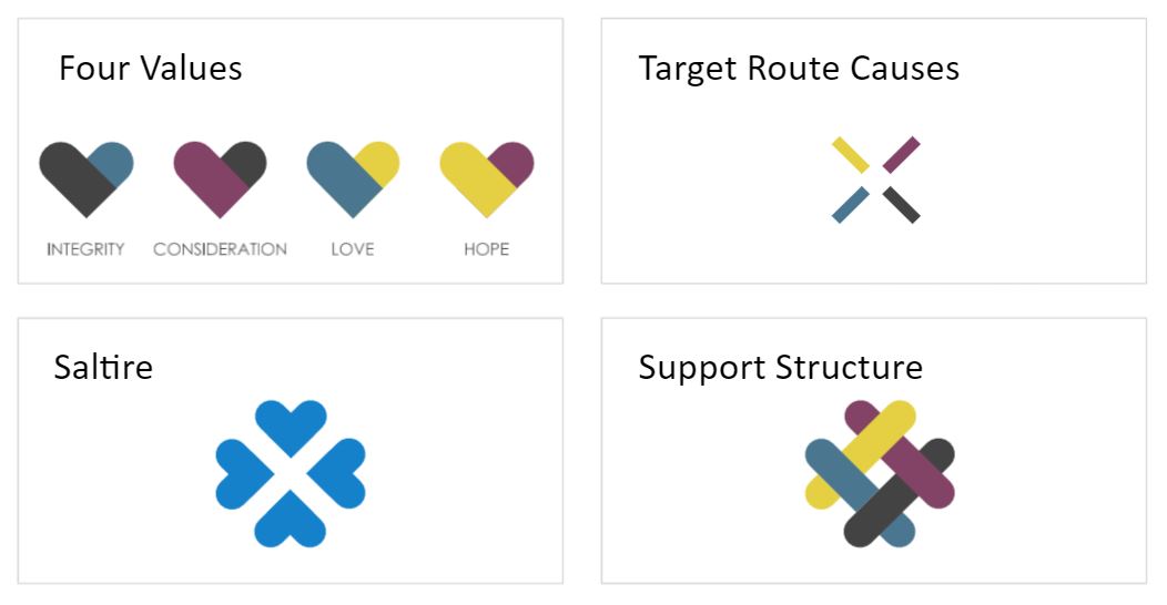
Once we had the colour palette finalised, we were able to play around with the different elements and see how each colour fitted together.
The Final Result
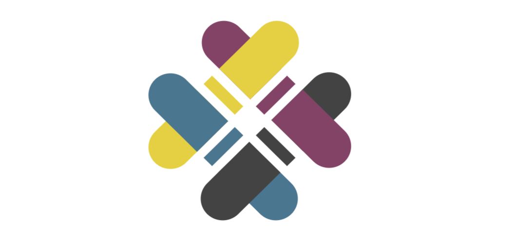
1. Unique: The logo had to be instantly recognisable - ✓
2. Contemporary: It had to be fresh, clean, youthful yet traditional - ✓
3. Flexible: Seamless across all the channels, mediums and applications - ✓
4. Scottish but not a cliche: It had to retain the Scottish association but in a subtle way - ✓
Looking to rebrand or refresh your logo?
Your logo is one of the first things a potential customer will see about your company, so it’s vital that you get this right. A well-designed logo can help customers remember and trust your brand even if they never come into contact with any other part of your business.
Our team has ample experience designing logos for a wide range of businesses and we follow this process for every client to ensure the final result represents what makes you unique in an engaging way.
If your brand lacks purpose and doesn't reflect your values it might be time for a change. Reach out! We would love to chat more to get to the heart of your story and help to create a brand that will last.


