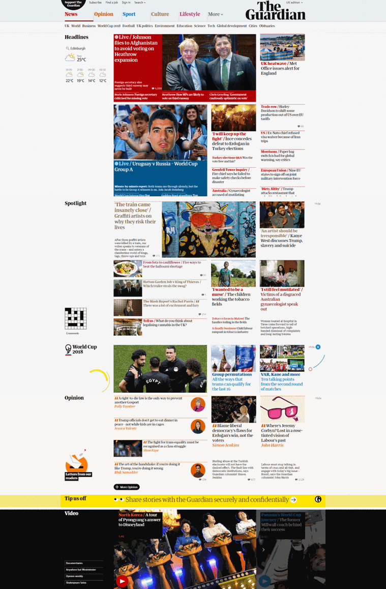
#1 - The Guardian
Since the mid-1980s, the famous lefty liberal newspaper has had a distinct look about it, always seeming to lead rather than follow with its design. That reputation grew stronger with the advent of digital. Alex Breuer’s arrival as creative director in 2012 brought new levels of consistency in terms of the titles digital properties, and a recent top to bottom rebrand and redesign shows the importance they place in creating a cohesive design language. In a world of overly sensationalist media and fake news, The Guardian’s marriage of good journalism with an innovative and stimulating presentation is one to be treasured.
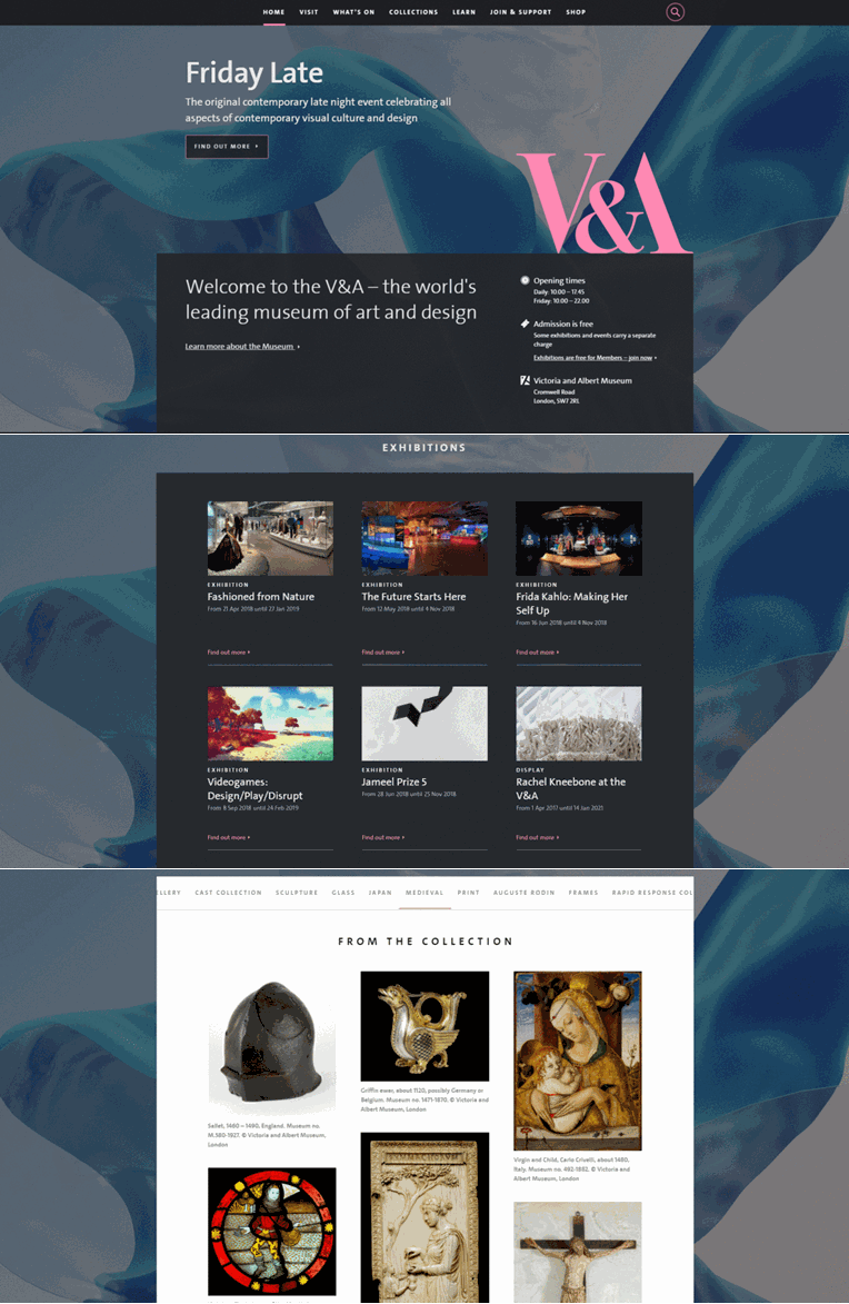
#2 - V&A
The website for a leading art and design museum should excite and inspire, and the V&A does just that. Backed up by a clever and bespoke content management system, the site successfully brings the museum and its vast collection to life online. Also one of the most singularly confident and brilliantly original expressions of an identity online. Click here to find out the inside story on the new V&A website.
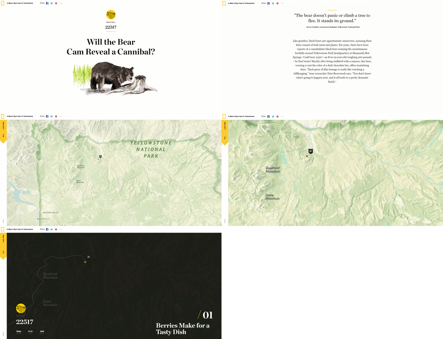
#3 - National Geographic - A Bear’s Eye View of Yellowstone
Quite simply a beautiful example of rich media storytelling. The constant scrolling aspect of this design is rewarding and never gimmicky. Fascinating content presented in a carefully structured and aesthetically elegant way.
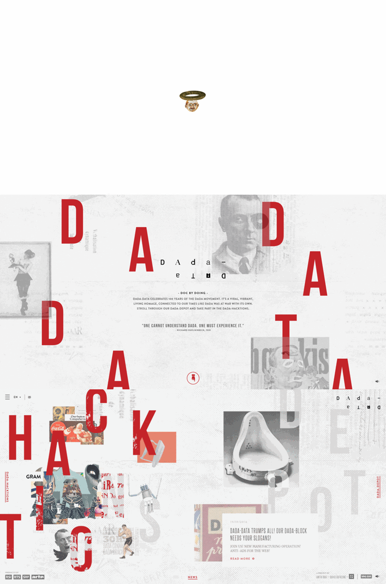
#4 - DADA-DATA
It’s tricky to define what this is exactly, so I’ll go with the description on the Awwwards entry of ‘digital documentary’. Dada was a modern art movement centred in Zurich a century ago consisting of Avante Garde artists keen to express their distaste for capitalism and the horrors of war. DADA-DATA was conceived to celebrate the movement’s anniversary in a suitably modern way. The main reason to admire this from a design point of view is the wonderfully experimental and non-conformist feeling it has. Moving around it conjures the feeling that you are looking at an enthusiastic design students pet project, albeit executed on a grand scale. The background music does irritate after a while though. Intentionally I’m sure.
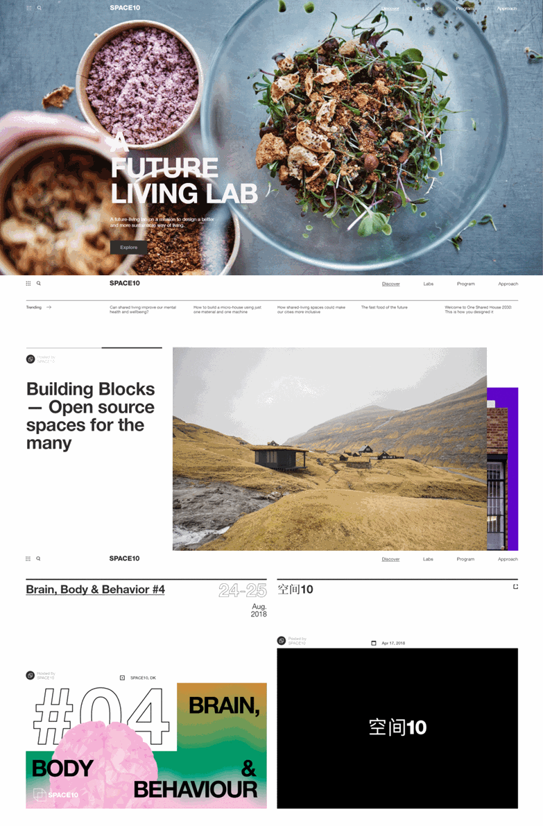
#5 - SPACE10
You can rely on Denmark to provide a beautiful design. This is a classic example of the clean minimalist aesthetic, held together with pitch-perfect Swiss style typography, and exquisite contemporary photography.
What are your favourite websites? We'd love to know! Send us your links at @wearegecko!
- Mark


